
Sometimes, Brands just lose their way.
Maybe they have a weak, limiting or non-existent set of codes?
Or they’re trying to be all things to all people?
Or they’re a soft echo of the competitors?
Or maybe just culturally irrelevant?
Here, we work with what you have, and figure out where you’re going wrong.
It usually involves a refreshed positioning and strategy, followed by a clear implementation strategy.
Brand Refresh
Our Brand Refresh creds
THE CHALLENGE
Taïm was a generic Mediterranean fast casual restaurant chain.
It had no positioning, no real points of difference, and no visual distinction.
What they did have was ambitious expansion plans to go from twelve restaurants to 80 by 2028.
That kind of growth is exceptionally challenging without total clarity on what your brand stands for, and total consistency in how you implement that.
No two restaurants looked the same

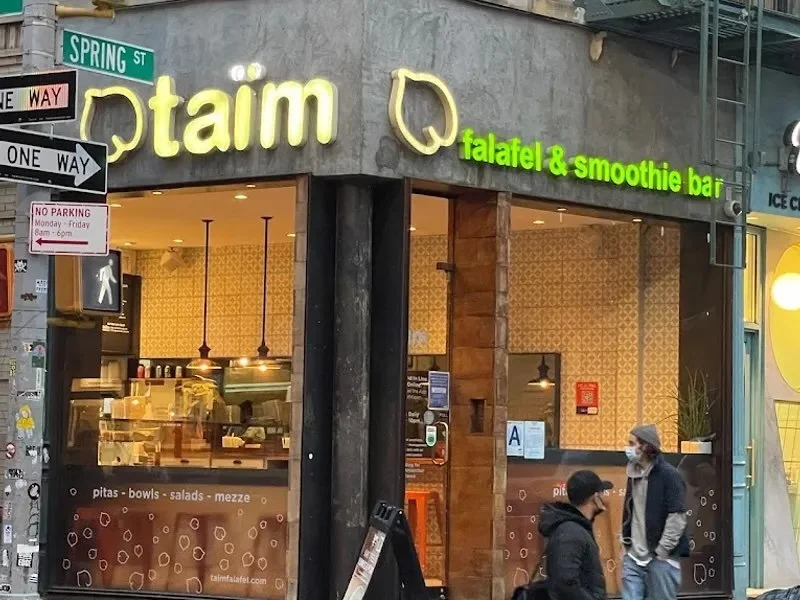

No two pieces of communication looked the same
What we did
Step 1: Differentiation
There’s a lot of trending bullshit right now that differentiation is passé. That brands only need distinction to thrive.
They need both.
Differentiation, or positioning as it is also known, provides a central set of coordinates against which all tactics can be assimilated. It’s vital for a brand’s longterm growth.
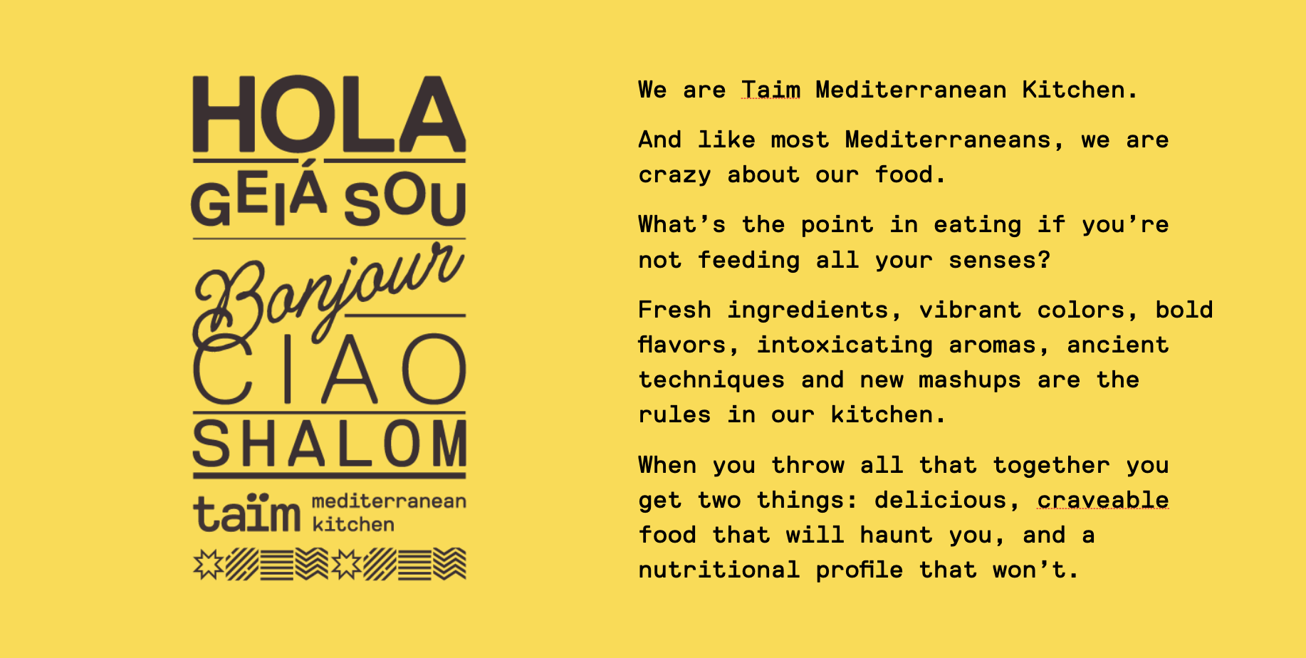
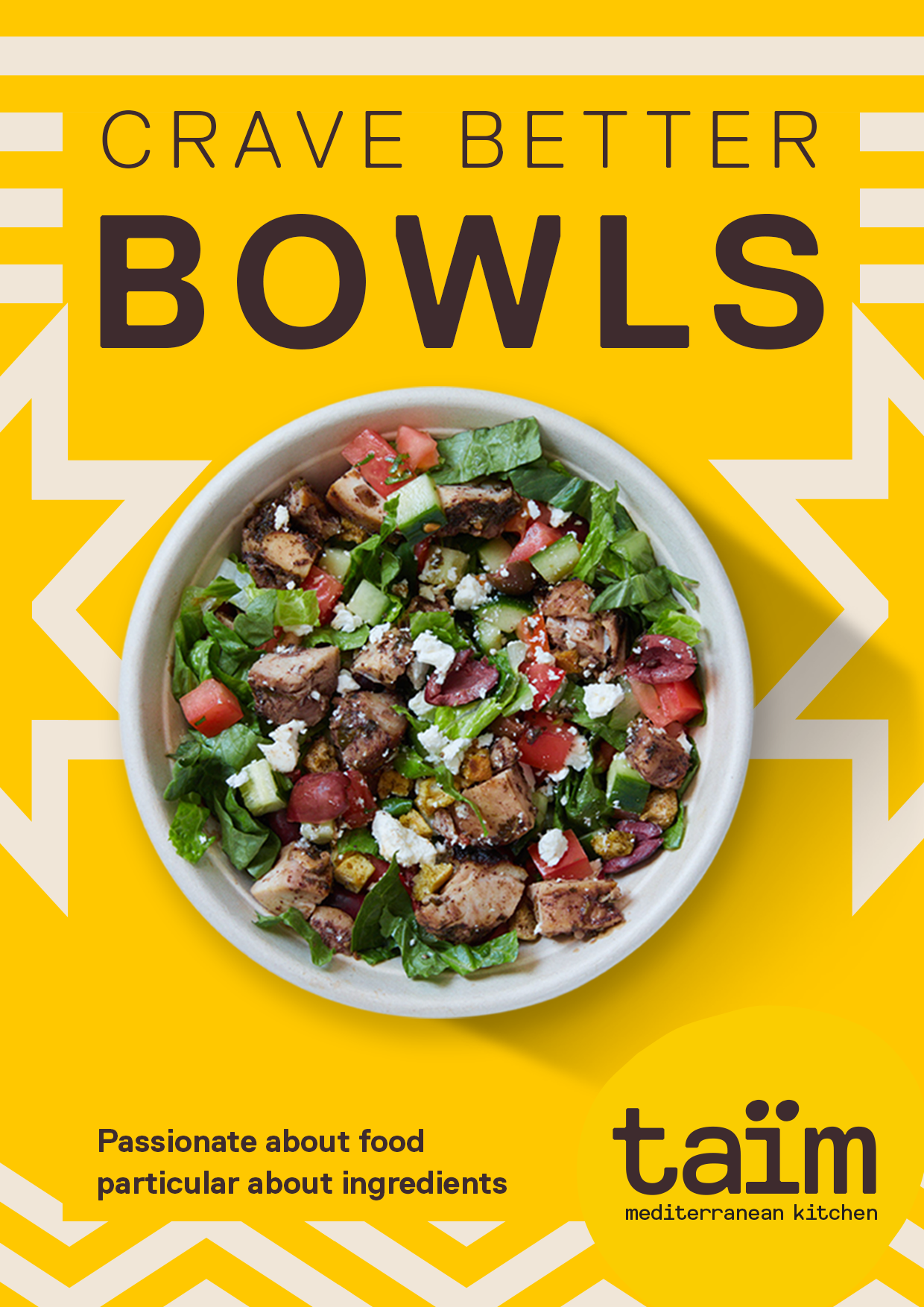
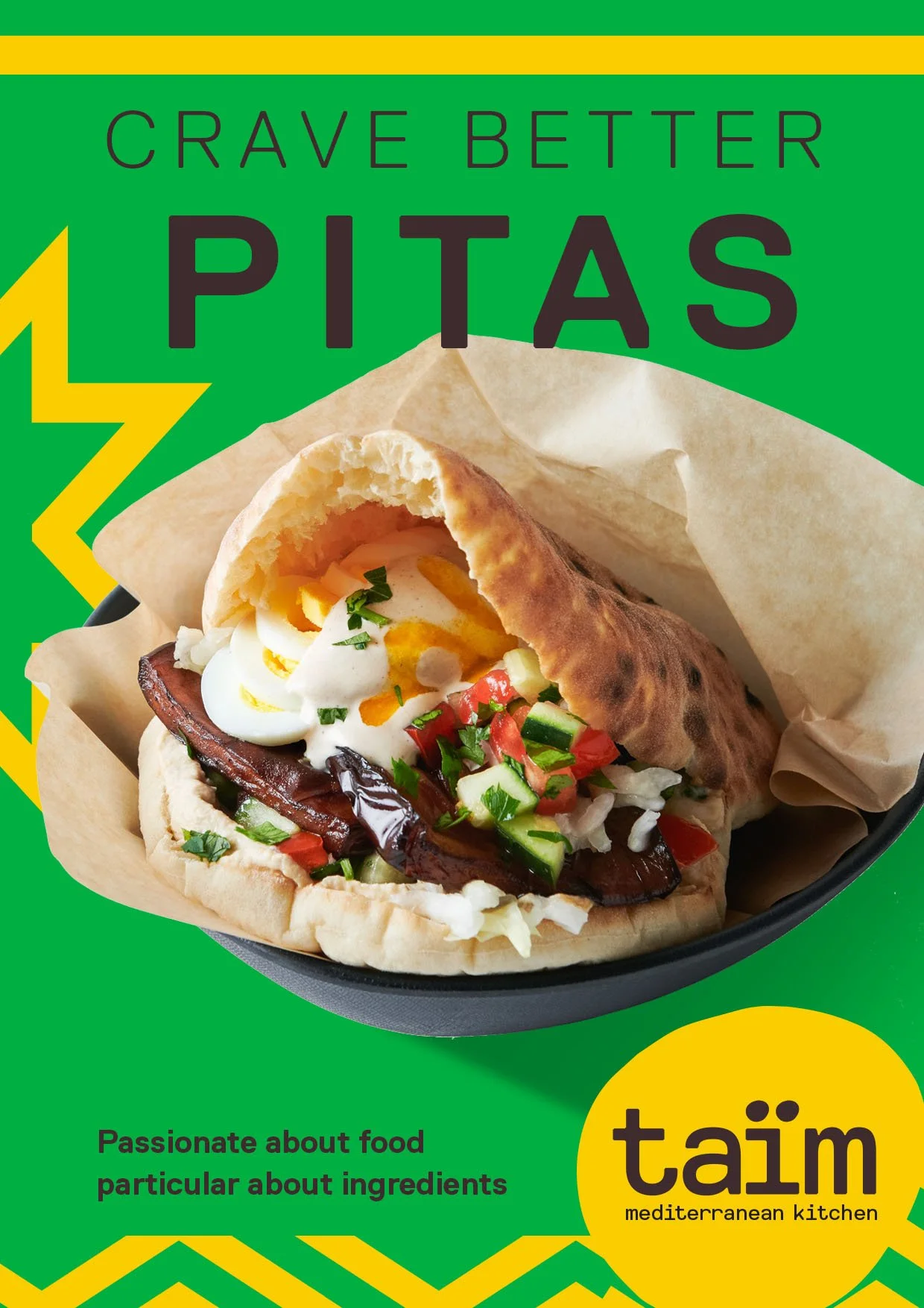
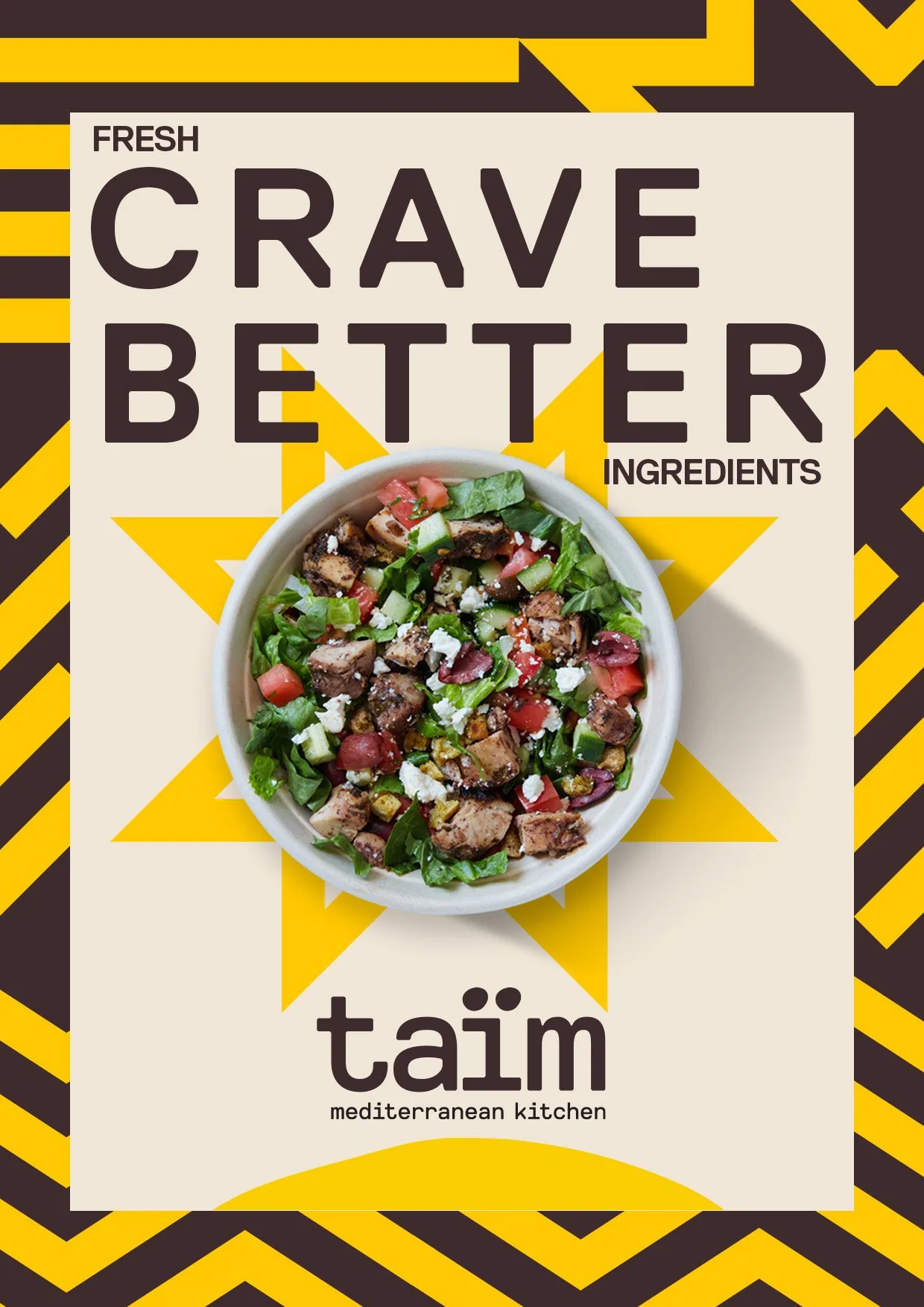
Taim was meaningless to consumers and generic in the category. Its food, ambiance and visual profile all needed to stand for something.

Every competitor in the category had a focus on either flavor or nutritional values. No one could talk to both.
Taim could. It was the real deal.
Founded by Chef Einat Admony, we had the right to own authentic and flavorful as the restaurants were already delivering on that through their food .
What we did
Step 2: Distinction
Now we knew what we stood for, we could bring it to life.
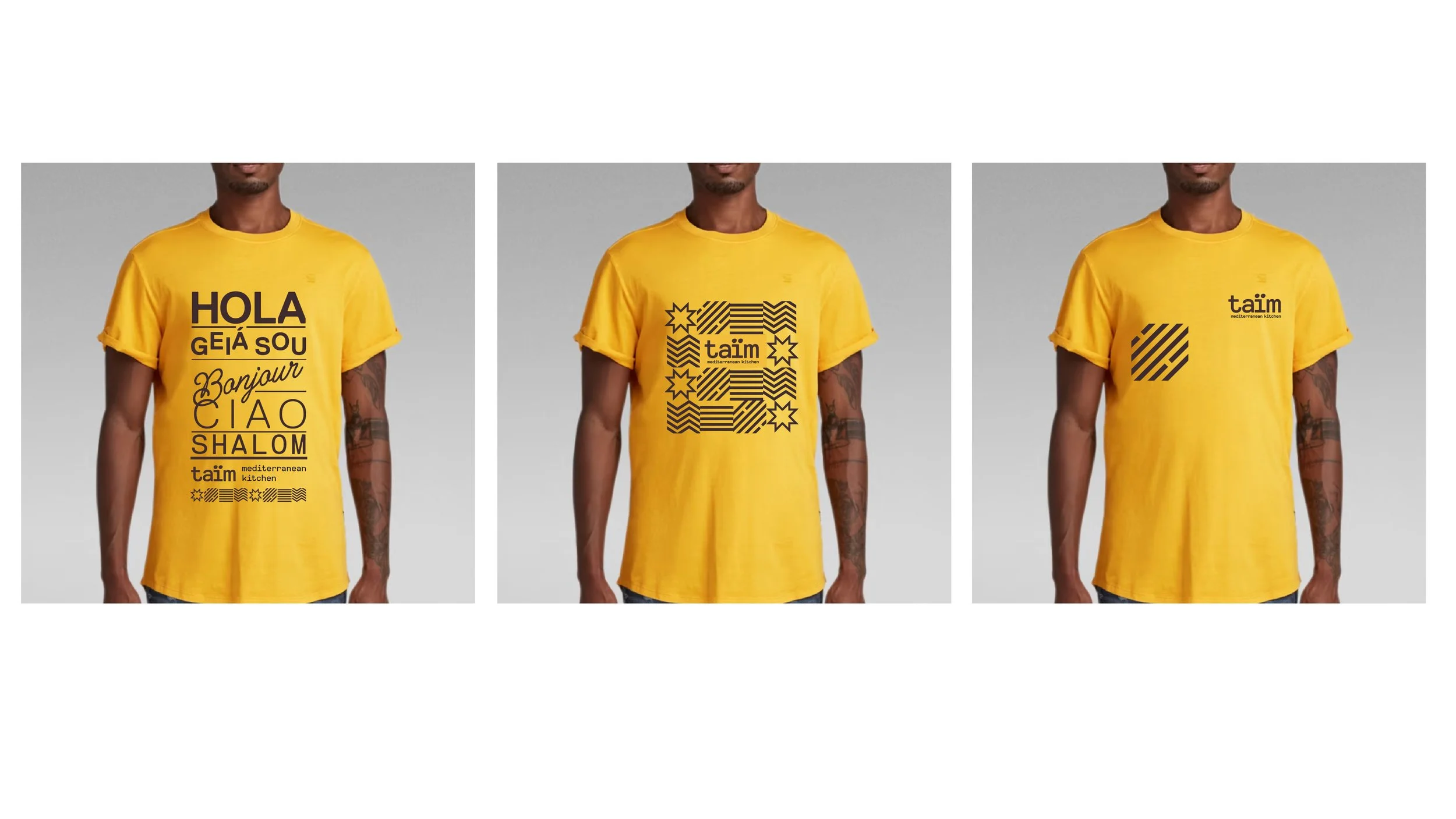
Taim’s biggest brand shortfall was that there were not enough distinctive assets for a designer to work with.
When you don’t give designers enough to work with, they tend to create a lot of their own graphics.
The knock-on effect of this is that your brand never shows up the same way twice.
We had to fix that.
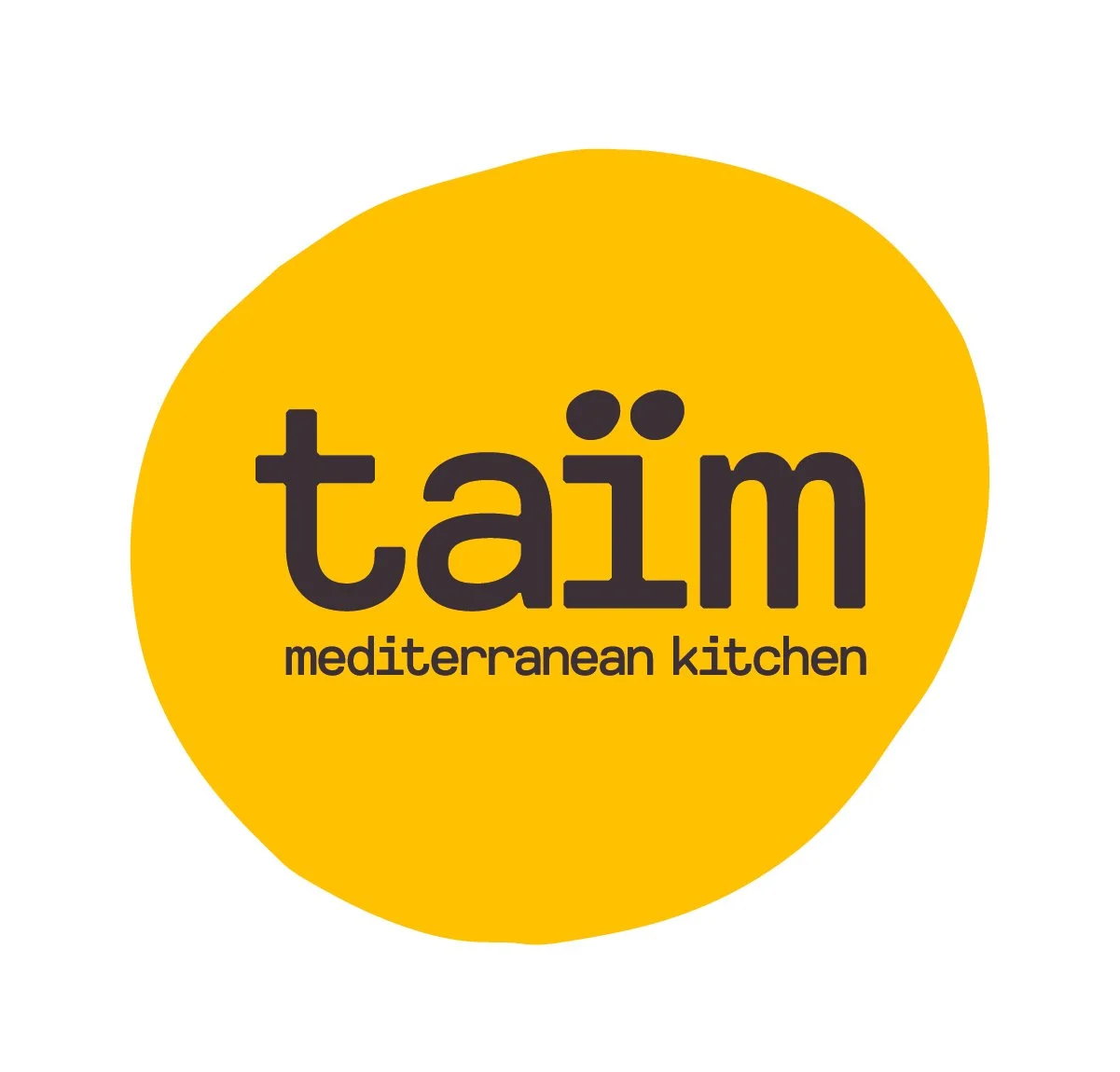
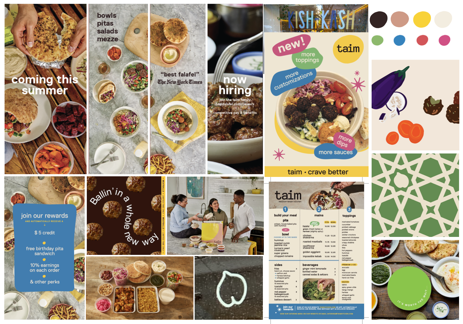
We created a single logo, revised and more vibrant color palette, clear and distinctive tone of voice, a consistent approach to typesetting as well as some much-needed visual graphics.
The result is a visually distinctive brand, that gives anyone that works on it enough elbow room to create visual variety within a consistent style.

Want to know more?
For a free 60 minute consultation on your brand refresh drop us an email using the form below.