
A startup? An established business that needs an overhaul? A new sub-brand? This is our comprehensive branding package.
It is an end to end solution covering a diagnosis phase, where we understand you, your brand and your category.
A development phase, where we build out your positioning and strategy.
And a delivery phase where we create all the distinctive assets you will need to thrive.
Brand Builder
Our Brand Building creds
Before…

After…
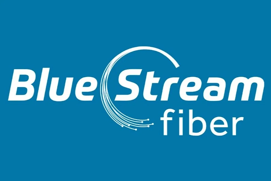
Rebuilding a high-speed Internet and streaming service in South Florida
The Challenge:
You can kind of see the challenge above. A misleading name coupled with an extremely lackluster design and we were about to launch Internet speeds six times faster than our competitors. You can’t claim superior technology yet look like a brand that’s been cryogenically frozen since the 1970s.
Our Approach
Our biggest rivals were Dish, Xfinity and Hotwire. Our offering was faster and cheaper than the competitors, and our positioning was to be the challenger in this market.
The Idea:
Blue Stream came from two places. The first was to figure out the most visible way to distinguish ourselves from the competition. Whilst our tech was a differentiator, it wouldn’t be long before others caught up, so instead we settled on a more visual and last difference. To be the only ‘blue’ brand in a sea of red competitors. The second was to use the word ‘stream’ as we knew this was starting to enter common vernacular.
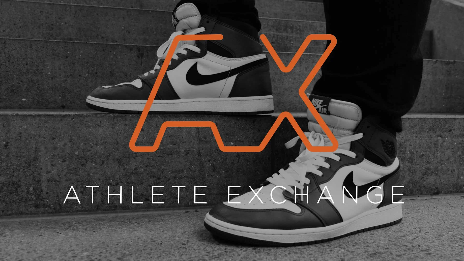
Creating a sub-brand for Wasserman’s Athletes
Many athletes have a bigger reach, and a more engaged audience than influencers as well as media and sports properties.
This presented an opportunity for Wasserman and their roster of over 2,000 athletes to create a one-stop-shop for branded content creation and distribution. All they needed was a name.
Our Approach:
An ‘Exchange’ is the act of giving one thing in return for another. We drafted a lot of names, but Exchange was always the most distinct and simple encapsulation of this new offering.
The Execution:
Since Athlete Exchange was a full service model designed to streamline branded content campaigns, we created a design that mirrored that.
A continuous line creating the A and X as a highly distinctive mark, and also to represent the fluidity of the process.
Creating a brands for Athletes
Whilst working at Wasserman, I oversaw the creation of numerous brands and logos for different athletes that we represented.
Here are the highlights and brief description of each.

Breana Stewart was the first overall pick in the 2016 WNBA Draft and is arguably the greatest college player of all time. We embarked on a re-design of her logo mark to ensure her brand identity better reflected her personality and style.

Rui Hachimura has already made history as the first ever Japanese-born player drafted into the NBA. The mark we created is unique to his family and heritage. The vertical portion of the H is an alternative version of the Hachi symbol, which makes up the first part of his last name when its written in Japanese. The katana going across to form the rest of the letter is another nod to his heritage as well as the enclosing shape which is meant to represent the rising sun.

Katie Ledecky is a swimming phenom with endless accomplishments ahead of her. She recently announced she will being going pro and the swimwear brand, TYR, will be her main sponsor. The development of a logo mark is a building block of her professional career and will be leveraged in partnership with TYR. The mark incorporates Katie’s initials with the angled shape and circle acting as the arm and leg of the K which can be interpreted as a swimmer springing into the water.
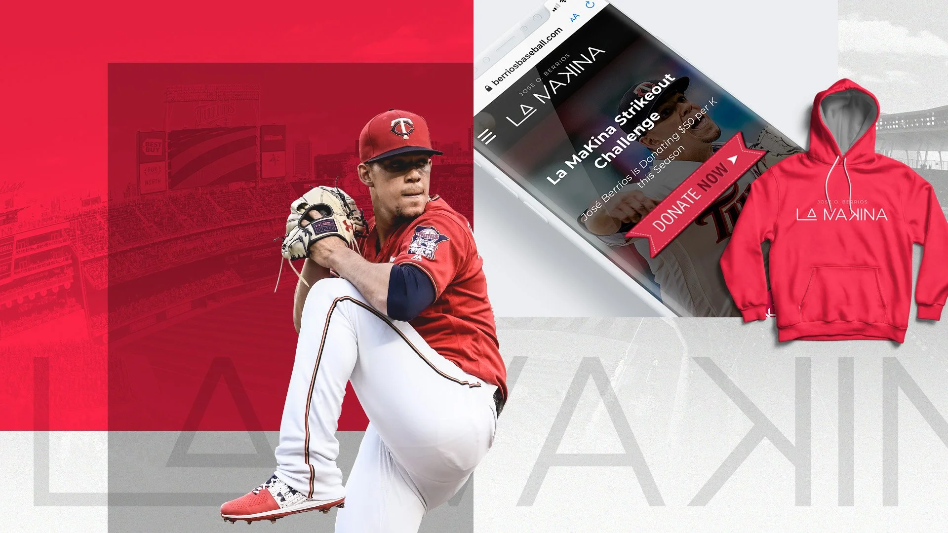
Jose Berrios is an All-Star pitcher for the Minnesota Twins. His previous agency owned his previous logo so we were tasked with reinventing it. Jose’s nickname, which translates to “The Machine”, speaks to his instinctive and calculated nature as a pitcher. Splicing the letters in La Makina drives home his style of play and in baseball a swinging strikeout is denoted as a backwards K as seen in the logotype.

Domas Sabonis was drafted in the first round of the NBA draft in 2016, following in the footsteps of his father who also played professionally. They even share the same number: 11. The ascender in the D is duplicated to visualize this number and celebrate Domas’s relationship with his dad.
Want to know more?
For a free 60 minute consultation on building your brand, our process and the minefields we must avoid, send us an email using the form below.